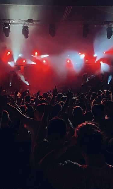
Live Wire is a concert booking website that will allow music fans of all ages to easily get tickets to go see their favorite artists in concert, focusing on local artists. We aim to support all artists, especially independent and local.
PROJECT DURATION
June 2024
MY ROLE
UX designer leading the Live Wire website design
RESPONSIBILITIES
Conducting interviews, paper and digital wireframing, low and high-fidelity prototyping, conducting usability studies, accounting for accessibility, iterating on designs and responsive design
THE PROBLEM
Currently available concert booking websites make it difficult to find local concerts and independent artists. Sometimes it can take them hours of research to find the independent artists they like in town, to enjoy concerts with their friends. Most checkout processes are lengthy and confusing.
THE GOAL
Design a concert booking website to be intuitive and user friendly by providing clear navigation, offering a fast and easy checkout process.
the project
SUMMARY
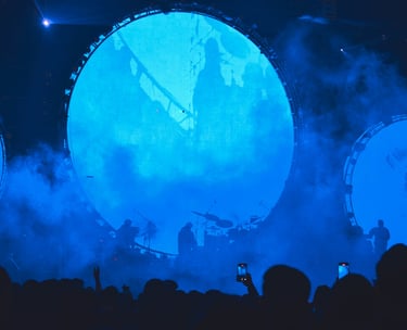
I conducted user interviews, which then I turned into empathy maps to understand the target user and their needs. I found out that many target users like to book concerts online to go with friends when they need a break from work or school.
Many concert booking websites are overwhelming and confusing to navigate, which frustrated many target users. Instead of having an enjoyable experience, they had a difficult time booking tickets, defeating the purpose.
USER RESEARCH
PERSONAS


Goals
Have an easier time booking tickets for concerts
Find more independent artists nearby
Go to more concerts with friends
"People should support more independent artists, we have bills to pay too!"
Frustrations
Getting tickets for independent artists can be a hassle
Tickets are always sold out by the time they find out about the show
Osei is a professional dancer and independent musician working in London, that always misses out on their favorite independent artists' concerts. Going to concerts makes them happy, specially with friends. Balancing work and social life is very hard for them, specially if they like independent artists.
Age:
Education:
Hometown:
Family:
Occupation:
osei adebayo
28
Bachelor of Music
London
Cat
Dancer and musician
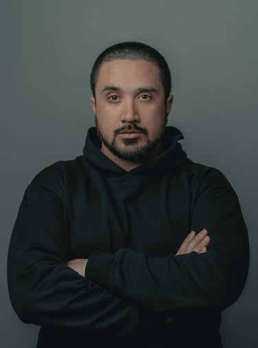
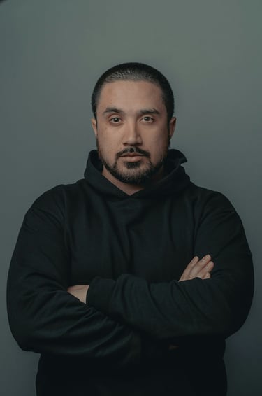
Necalli popoca
Age:
Education:
Hometown:
Family:
Occupation:
36
High School
Barcelona
Single
Front-end developer
"Going to concerts makes my life lighter and more fun!"
Goals
Go to more concerts in his area
More financially accessible prices for more friends to get tickets
More intuitive web designs
Frustrations
"A lot of concerts aren't budget friendly for all my friends"
"Accessibility at venues are horrible and aren't always noted on a lot of concert booking websites"
Hard to find independent local concerts
Necalli is a self-taught freelance front-end developer based in Barcelona. He's always looking for concerts in his area, but most of them are expensive for some of his friends that have a tighter budget. He has a friend with a physical disability, and they don't always know when venues are accessible, so they can't always go to concerts together.
PERSONA A
PERSONA B
PROBLEM STATEMENT
Osei is a busy dancer and musician who needs to get concert tickets in time because they want to go to more concerts with friends to support independent artists.
PROBLEM STATEMENT
Necalli is front-end developer who needs budget friendly concert tickets because not all of his friends can enjoy the experience with him.
user research: pain points
User journey map

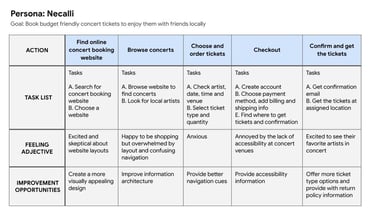
The user journey map of Necalli's experience revealed how important it is to address simple but important pain points like accessibility for people with disabilities, to find improvement opportunities.
NAVIGATION
Concert booking websites are often busy, which results in confusing navigation
1
experience
Concert booking websites don't provide a clear and engaging browsing experience
ACCOUNT
Some users are used to creating accounts, while others don't enjoy that process. Account creation should be optional
ACCESSIBILITY
There is a lack of places equipped with easy access for people with disabilities
2
3
4
sitemap
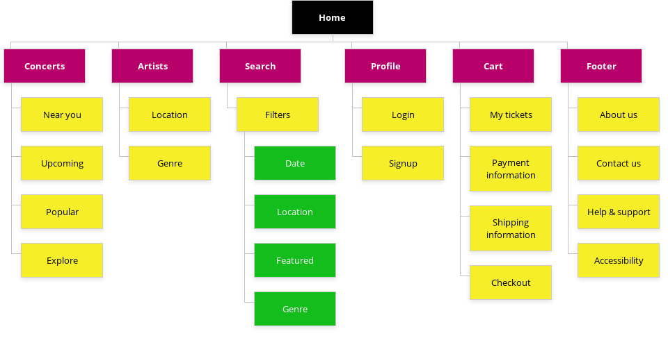
Difficulty with website navigation due to busy and confusing designs was a main pain point for users, so I created a sitemap based on that knowledge.
My goal here was to make a simple and easy sitemap to improve overall website navigation.
LOW-FIDELITY PROTOTYPE
For the low-fidelity prototype, I connected all the screens for the primary user flow, with a simple order and checkout process.
At this point, I had received feedback from friends and family about things like placement of buttons and page organization. I made sure I listened to their feedback, and I implemented several suggestions in places that addressed user pain points.


starting the design

paper wireframes
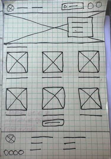

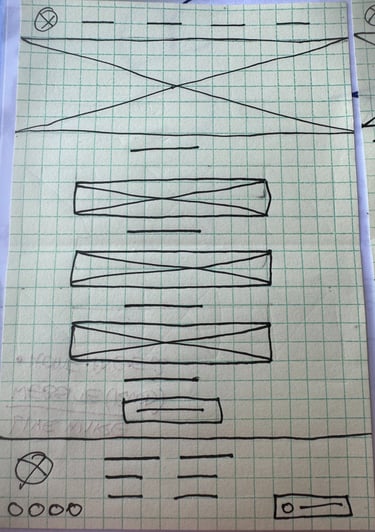
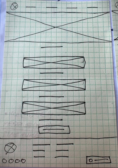
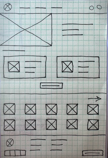
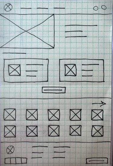
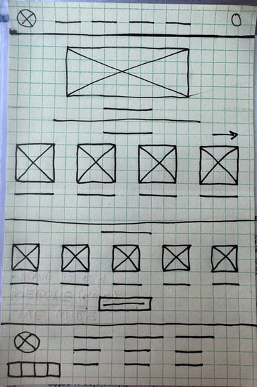
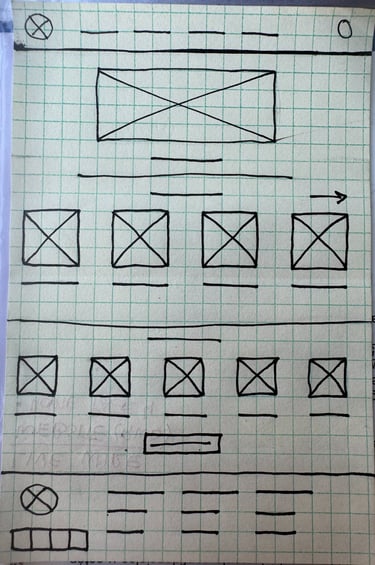
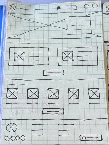

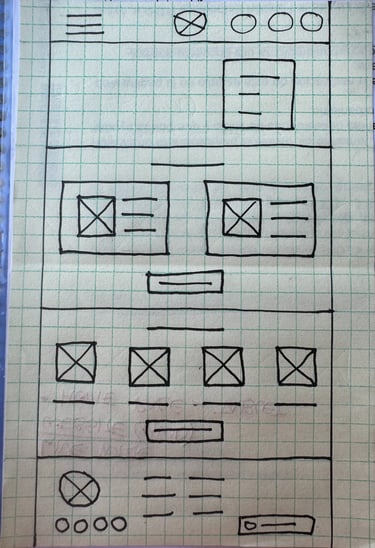
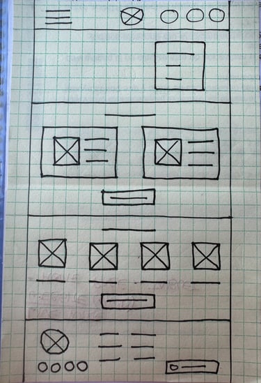
Next, I sketched out paper wireframes for each screen in the website, keeping the user pain points in mind.
The home screen paper wireframe variations focus on optimizing the browsing experience for users.
home screen variations
home screen screen size variations
Live Wire users access the site in a variety of different devices, so I started to work on designs for additional screen sizes to make sure the site would be fully responsive.


tablet
mobile
digital wireframes
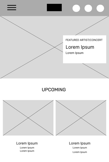
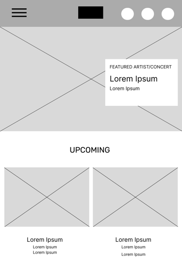
Moving from paper to digital, made it easy to understand how the redesign could help address user pain points and improve the user experience.
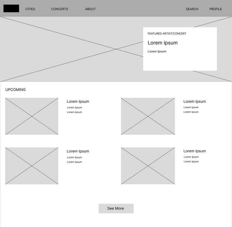
Prioritizing an open layout with clear visual element placement on the home page was a key part of the design.
Easy access to concert browsing
Home page is optimized for easy browsing with an open layout and nav menu options.


digital wireframe Screen size variations
USABILITY STUDY: PARAMETERS
STUDY TYPE
Unmoderated usability study
PARTICIPANTS
5 participants
LOCATION
Spain, remote
LENGTH
20-30 minutes
USABILITY STUDY: FINDINGS
These were the main findings uncovered by the usability study:
1
2
3
accessibilitY
During the checkout process, there is no accessibility information about the venues.
ChecKout
Users want a faster and easier checkout process.
Account
Some users find creating an account a tedious task.
MOCKUPS
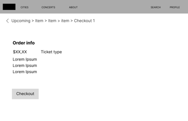
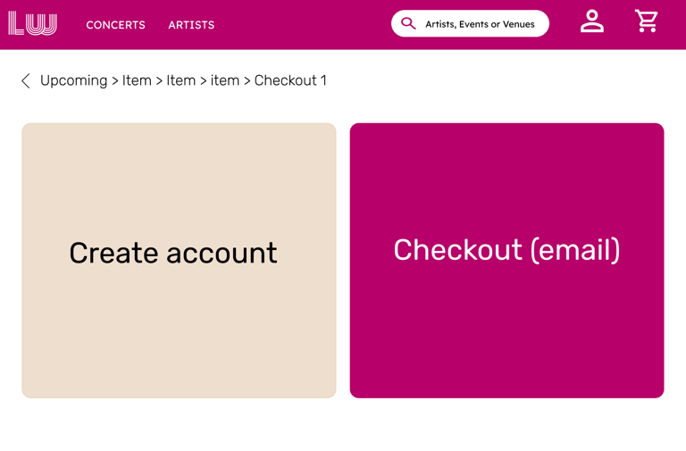
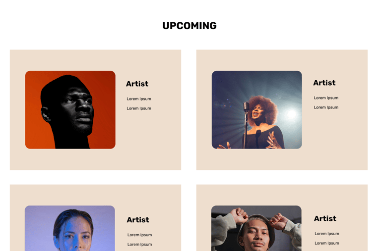
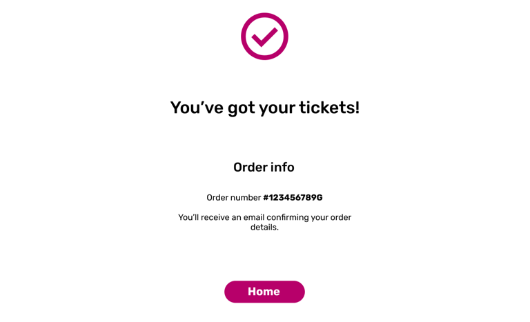
Based on the insights from the usability study, I made changes to improve the site's primary checkout flow. One of the changes I made was adding the option to edit the quantity of tickets, while ordering before checkout with a simple "+" and "-". This gave users the option to edit the amount of tickets without going back to the checkout process.


BEFORE USABILITY STUDY


AFTER USABILITY STUDY
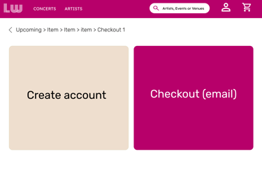
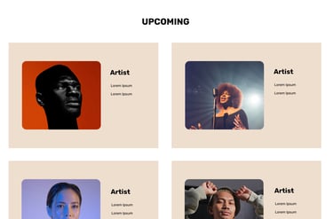
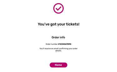
I included considerations for additional screen sizes in my mockups based on my main wireframes. Since users book tickets from a variety of devices, it's crucial to optimize the browsing experience for a range of device sizes, like mobile and tablet, so users have the best experience possible.

BEFORE USABILITY STUDY
AFTER USABILITY STUDY
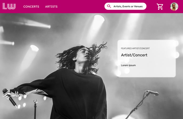



HIGH-FIDELITY PROTOTYPE


The hi-fi prototype followed the same user flow as the lo-fi prototype. I included design changes after the usability study, as well as changes based on my friends and family's feedback.
1
I used headings with different sized text to improve visual hierarchy along with familiar icons to make the navigation faster
ACCESSIBILITY CONSIDERATIONS
2
I used landmarks to help users navigate the site, including users who rely on assistive technologies
I designed the site with alt text available on each page for smooth screen reader access
3
refining the design
Mockups: original screen size
Mockups: screen size variations
To make the checkout process easier for users, I added the account creation process as an option for users that don't enjoy that step.


tablet
Mobile
TAKEAWAYS
IMPACT
Our target users shared that the design was intuitive to navigate through, more engaging and attractive with the images, and demonstrated a clear visual hierarchy.
WHAT I LEARNED
A small design change can have a huge impact on the user experience. The most important takeaway for me is to always focus on the real needs of the user when coming up with design ideas and solutions.
NEXT STEPS
1
Conduct follow-up usability testing on the new website
Identify any additional areas of need and ideate on new features
2
going forward
Thank you for your time reviewing my work!


live wire